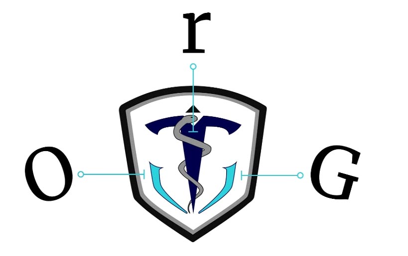
Our Logo
The ORG Logo
“A logo doesn’t sell (directly), it identifies.” — Paul Rand

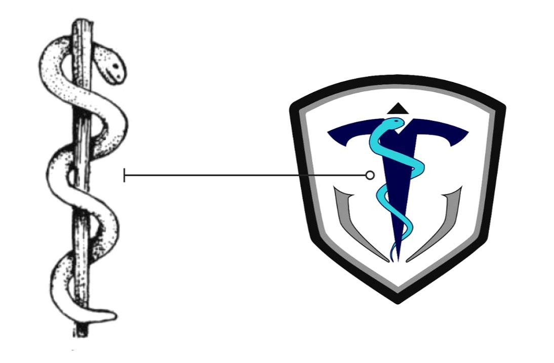
The logo represents the ideology of a group. Our logo was designed in-house by the passionate founding members to ambitiously represent the focus of ORG. On a lighter note, the logo symbolizes ORG with the serpent from the sceptre of Aesculapius representing the association with medicine and health care.
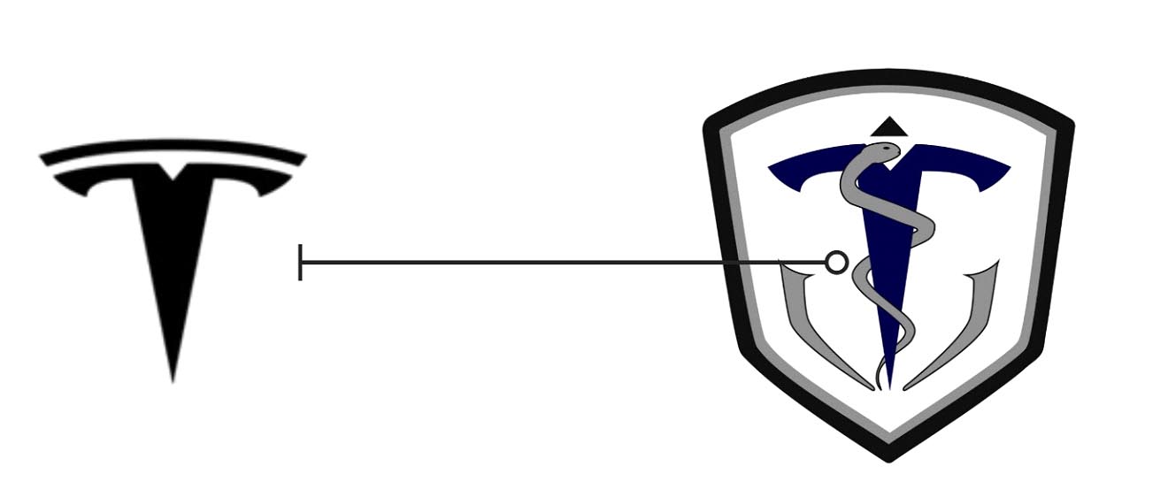
A look with the deeper intent will reflect the focus of ORG. The R of ORG is inspired from the T of Tesla - the modern-day benchmark for translational research and product development.
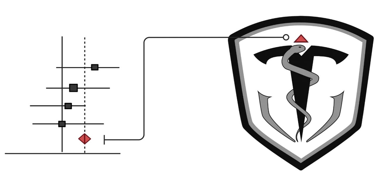
The crown on the top of the serpent is the 💎 of the forest plot - indicating ORG's love and respect for level 1 evidence studies.
The serpent also represents the highest of energy as per the Indian mythology. Thus the logo symbolizes our great enthusiasm to achieve enormous success in translational research in the field of Orthopaedics forming the core of the Orthopaedic Research Group as symbolised below.
